I was asked to take photographs anytime within a 24hr period as part of a project that invited young photographers around the world to do the same. If you have a Financial Times subscription you can view the article here
thomasduffieldphoto@gmail.com
+44 (0) 7788236022
I was asked to take photographs anytime within a 24hr period as part of a project that invited young photographers around the world to do the same. If you have a Financial Times subscription you can view the article here


Delighted to have made the shortlist for the LUCIEFOUNDATION X CHROMALUXE fine art scholarship.

Over the moon that 'The Whole House Is Shaking' made the nominations list for the Unveil'd Photobook Award 2017.

Congratulations to Shane Lavalette for making first place. I was really happy to be in such great company, the full list can be seen here : https://unveild.co.uk/photobook-award-2017

The lovely folks at It's Nice that interviewed me a couple of weeks back about the project 'The whole house is shaking' Now available at Tide Press


I had the absolute pleasure of talking alongside Joanne Coates in the latest instalment of the miniclick Yorksire series.
Thank you all so much for coming along!
Check out Jo's work here http://www.joannecoates.co.uk

Thanks to the good old Ashleigh Taylor for the photograph
I am delighted to announce that my project 'The whole house is shaking' has been featured in the August 2017 issue 'Look & Learn' -
The project is also online here : http://www.bjp-online.com/2017/07/thomas-duffields-whole-house-is-shaking/

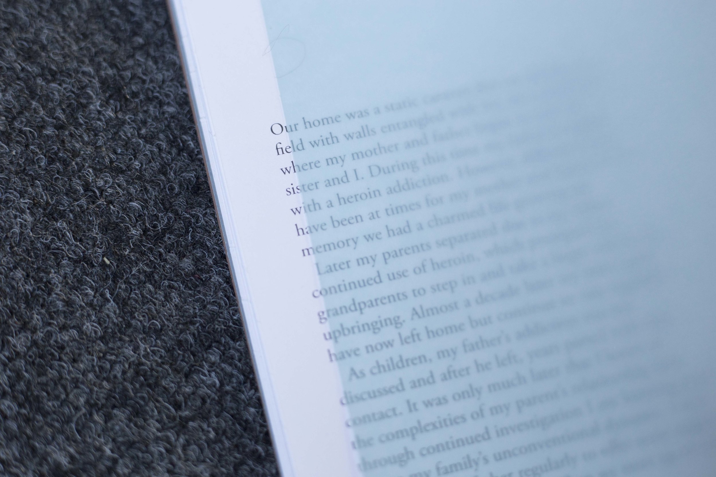
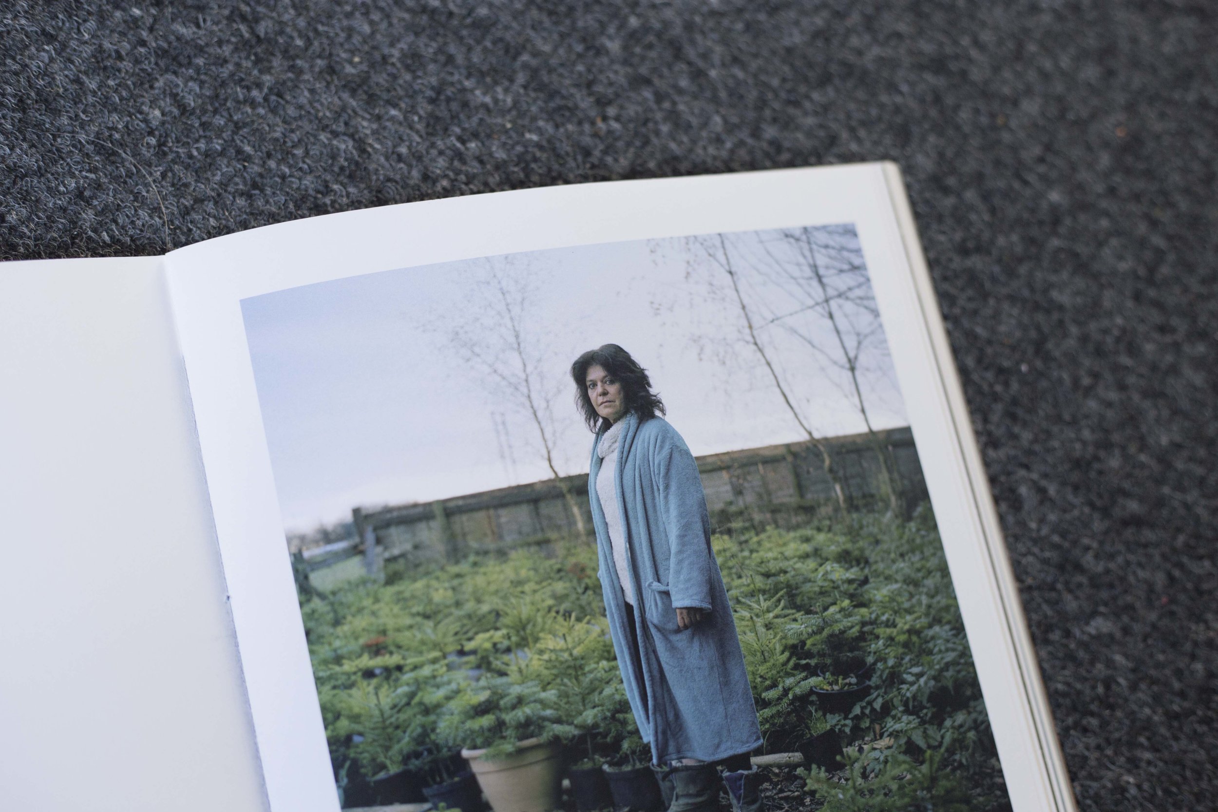
I have refined the design of my photo book and allowed the Photographs themselves to speak for the project. The book is HP Indigo printed on Mohawk superwhite ultrafine paper (too many super's and ultra's for my liking) The paper is 148gsm and it's beautiful haptic qualities lend it to book making. I chose the paper because it feels like matte paper to the touch, However, It is lightly coated allowing detail in the shadows and quality colour reproduction.

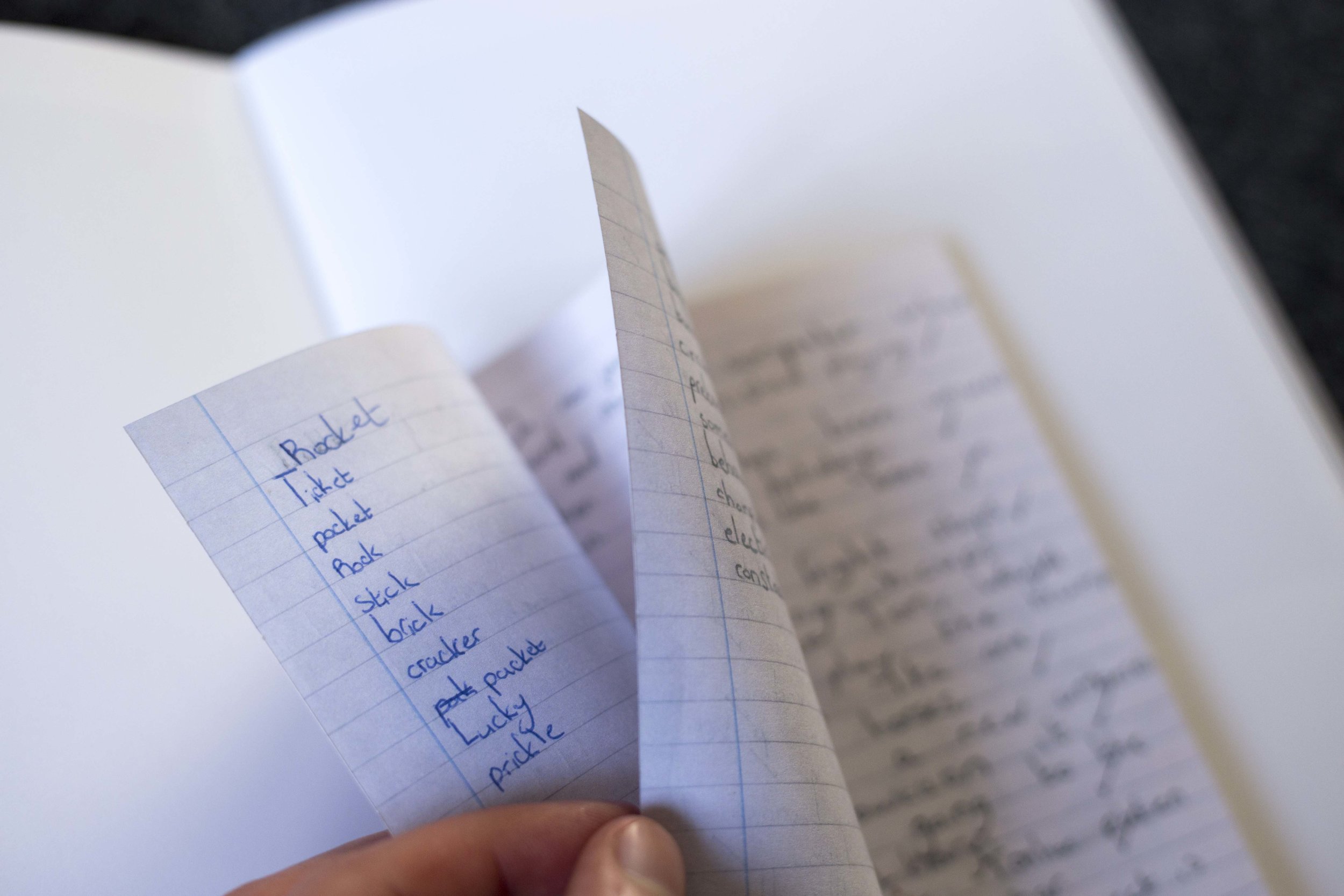
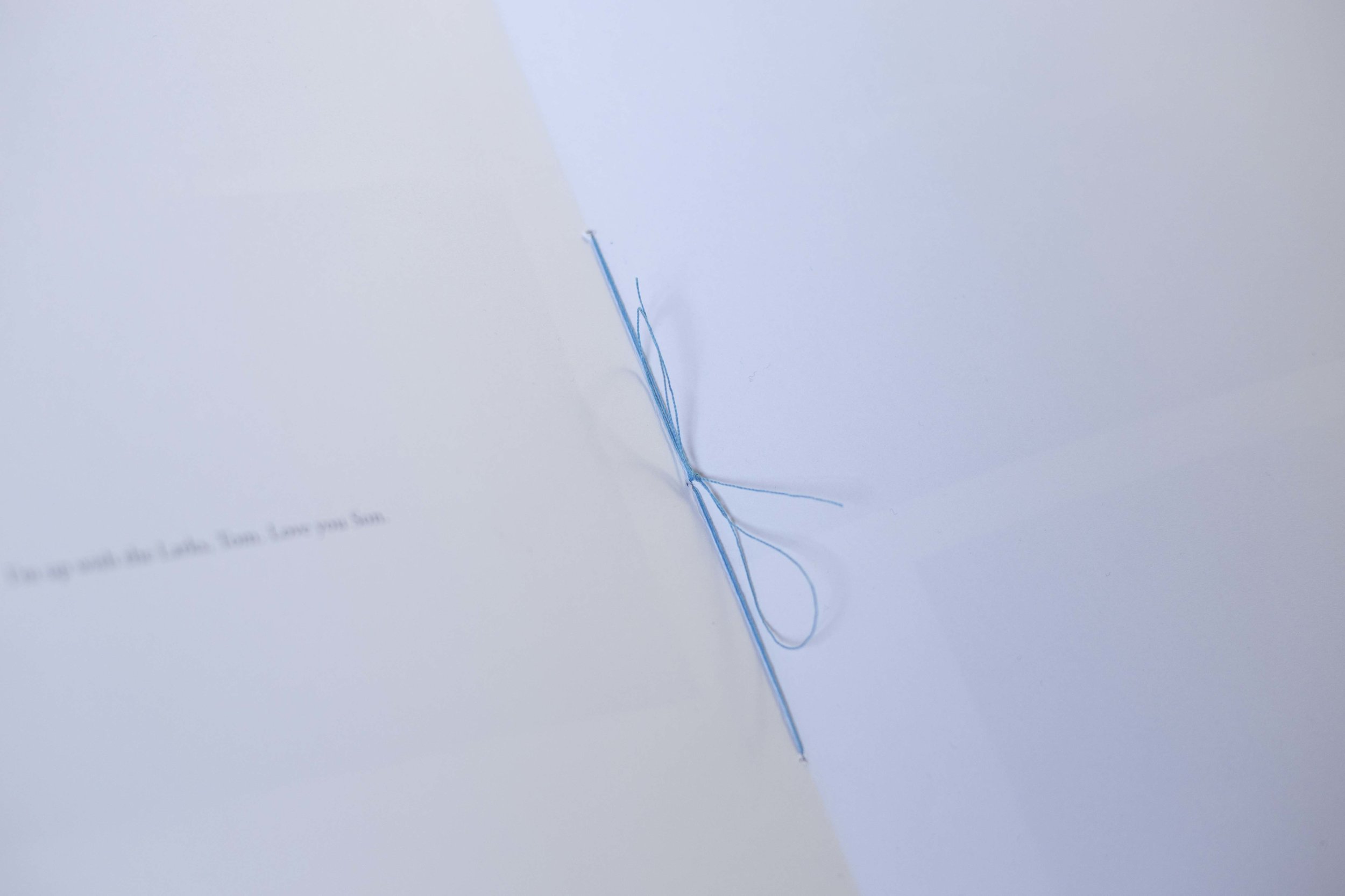
I have hand stitched a text inlay in the book which adds a sense of curiosity and discovery to the work, thus reflecting the nature of the project.
The book is covered with Brown Colorplan and is wrapped with a sash. The end papers are translucent blue which fits well with the colour palette used in many of the photographs and also allows the text to be partially concealed by the paper, encouraging touch and investigation.
The sequence and selection of photographs in the book have altered and refined through a number of prototypes. In the coming year I aspire to have a small batch published.
Enabling warning on photoshop to ensure that all will be printed. this ensures that there will be no blank spaces left without ink in the highlights.
This is one of the photographs I have sent to Divebar print in Brighton. Divebar is run by Jack latham, After seeing his work I figured he would have an attention to detail in printing.
- I will see how it goes !\

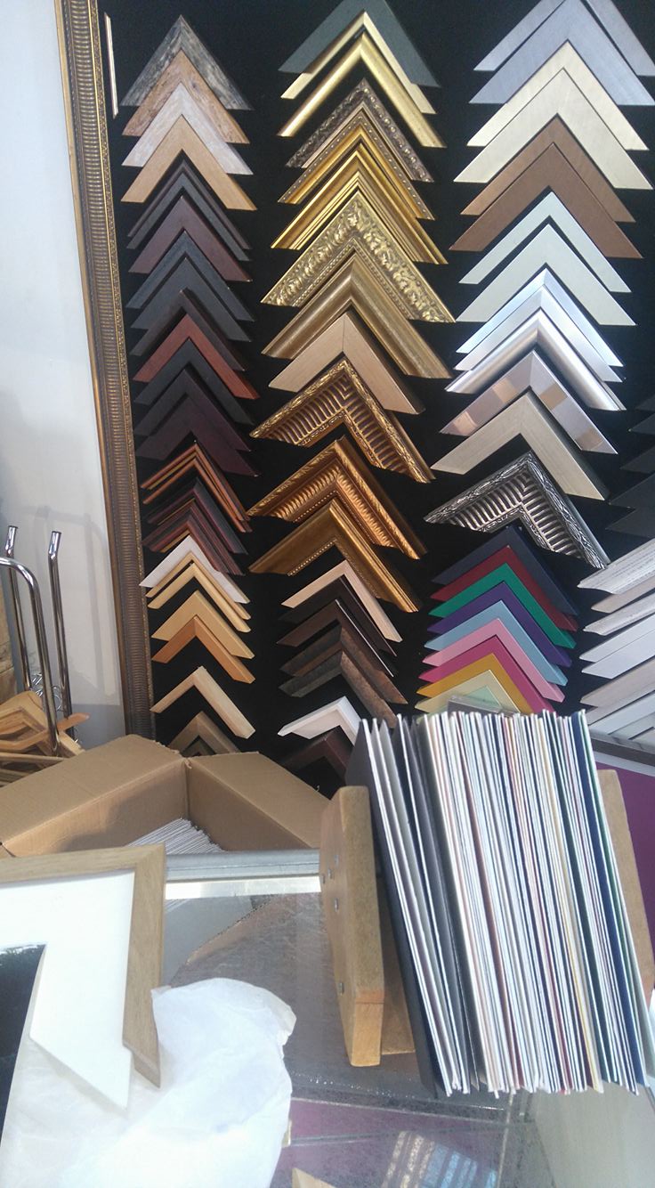
Framing is something that I had not given a great deal of thought towards until the last couple of months. There is an array of decisions to be made - and when the price is high you want to know what is best!
2014 phone quality
There was a huge choice of frame materials and colours. Also the option of a window mount which I believe lends itself to certain projects. The mount gives the photograph space and a presence. The eyes are drawn from corner to corner with nothing partially obscured in corners of wood and glass.

test.
I chose an oak frame with a white window mount. The photograph is relatively small at 12'x12' which suits the personal nature of the project. The oak frame is reminiscent of those in our own home, however, this is actually oak not MDF.
Thanks !
I have recently received a beautiful print from Divebar, an independent print service based in Brighton and setup by Jack Latham. Because the team are passionate and skilled when it comes to photography I know they will strive for graet print quality.

Exhibition print no 1
I went with Ilford gold fiber silk as a paper. This paper is known for its resemblance to traditional silver halide archive paper. It has a light shine and can produce a remarkable color gamut. Lots of my photographs have are on the green/blue end of the scale and this paper offers me the ability to render those colours well.
Initially, I printed at our university service but the limited paper stock detered me in this instance. I thought I would pay for expert printing and quality framing to finish with a final product that I am truly proud of.
Now just need them to flatten and get them framed!
'We aim to draw attention to and celebrate, the talent emerging from our locale. Fresh Aire is a platform that strives to help catalyse graduates’ transition from their university courses, to the creative industry and career beyond.'
A great chance to be considered for exhibition in Leeds for free.
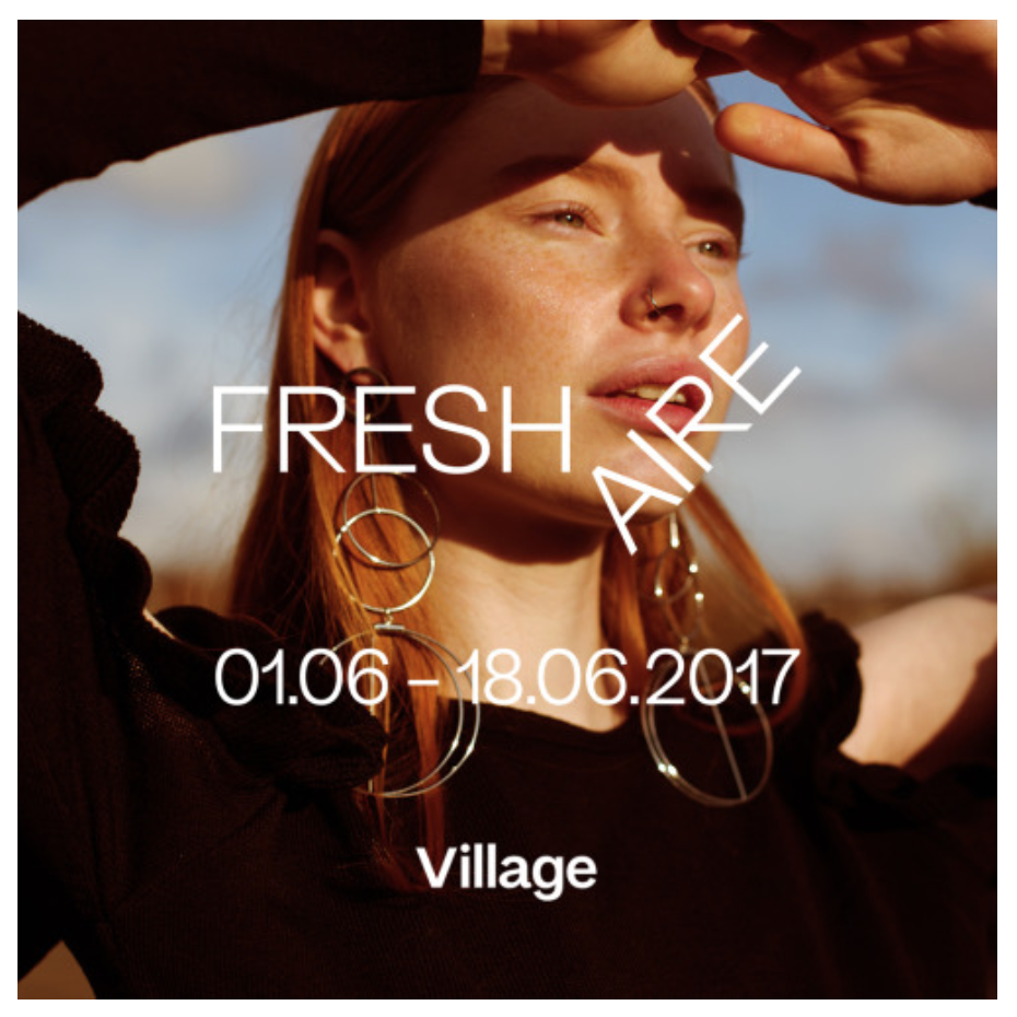
Identity design Josiah Craven / photograph by Harrison France
If you have come this far check out Village books Leeds too (where the show will be held)
I'm not sure if this counts as research. It should.
Interview with Stefan Ruiz